The annual DC Design House showcases an array of style inspirations from a talented roster of interior designers.
Living spaces can be transporting, evoking a homeowner’s personality, history and lifestyle. Stepping into this year’s DC Design House is no different except that it elicits 21 different style sensations based on each participating designers’ unique vision. In its eighth year, the design house benefits Children’s National Health System while giving local talent a chance to show off their work.This time, ingenuity reigns supreme as simple closets take on new identities as mini-bars and otherwise forgettable corners evolve into cozy reading nooks.Every space in the 11,242 square-foot Wesley Heights house has been masterfully upgraded to excite and inspire the inner creator in us all.

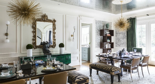
The ceiling of Jonathan Senner’s (Atelier Jonathan Senner) dining room is covered in a metallic paper resembling antiqued mirror. Circa Lighting illuminated the room. An antique Louis XVI-style black and white striped bench in the corner of the dining room. (Photo by Angie Seckinger/ DC Design House)
DINING ROOM: The five-story residence, built by Gibson Builders in 2010, previously housed the French Ambassador while his Kalorama residence was being renovated. It is no wonder then that the walls spoke to Jonathan Senner’s inner-Francophile when he first laid eyes on the large white dining space. He immediately envisioned giving it life through Schumacher’s “La Cité” wall covering – a black and white print based on an 18th century Turgot map of Paris. From there, Senner worked outward, playing with Parisian themes by pulling pieces from different eras of French design. He drew color inspiration from Napoleon III’s apartment at the Louvre, using rich greens, gold and black accents to draw the massive space inward. “I felt we really needed to bring down scale and make it more warm and inviting,” Senner explains. Fearing that one long dining table might overwhelm the room, he enlisted furniture craftsman Keith Fritz to create a set of two custom art-deco inspired tables made with dark walnut and book-matched ziricote.

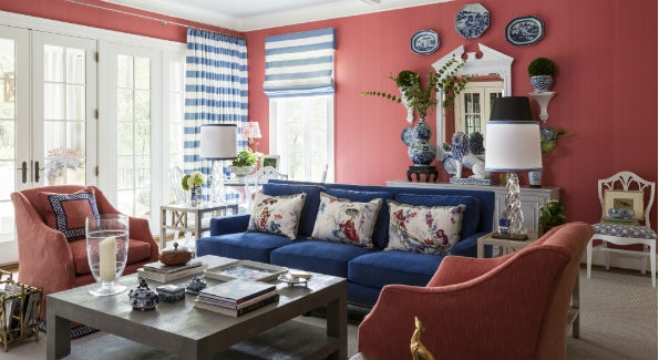
n Kelley Proxmire’s family room (Kelley Interior Design); a glass game table sits next to windows treated with Clarence House striped curtains. Five entry ways give the living room ample light. Ceiling paper is Schumacher ‘Abstract Leaf’ in dove. (Photo by Angie Seckinger/ DC Design House)
A COZY, CORAL LIVING ROOM: You might call Kelley Proxmire a design house natural as she checks off her 24th show space. Like most of her concepts, Proxmire started with a print – in this case a Schumacher ‘Plaisirs de la Chine’ bleu and rouge fabric. Considering the space’s surplus of natural light, she was not afraid to make the room pop with color, using a custom coral Farrow & Ball wall covering. Proxmire hopes that visitors walk in the “pretty and practical” room with the intention of sitting and staying awhile. She pulled rich blue and white porcelain plates, vases and statues from her world travels to balance the color scheme.

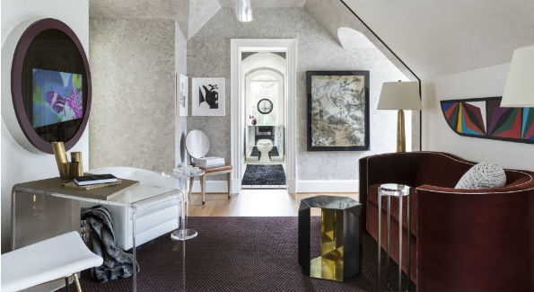
Like many of her projects Rachel Dougan’s (ViVi Interiors) Lady Lair was inspired by art. Four works are from local artist Martin Swift. The geometric piece was commissioned and painted by Jorge Caceres. (Photo by Angie Seckinger/ DC Design House)
LADY LAIR: If men can have a cave, then surely women deserve a lair. That was Rachel Dougan’s thought when she initially came upon the secluded asymmetrical space situated above the kitchen.With two dormer windows on either side of the main room and many angles to contend with, she settled on a malachite faux paint to cover the walls and a black fabric trim to frame a strip of white faux leather running through the center of the room. Using a plush burgundy sofa as an anchor, Dougan was able to craft a sense of balance in the wonky space. She took design inspiration from the Orient Express, aiming to achieve an atmosphere both “comfortable and luxurious” with transporting style motifs influenced by her childhood living in Asia and Europe.

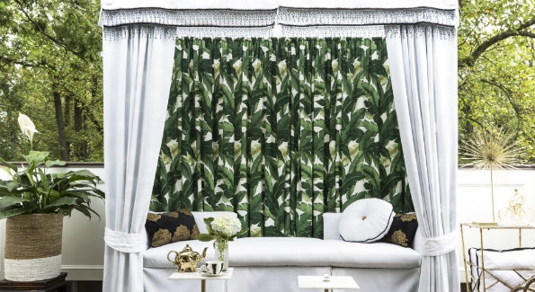
Quintece Hill-Mattauszek (Studio Q Designs) wanted to create a “cool entertainment area” for cocktails or tea. The canopy fabric is from spoonflower.com.(Photo by Angie Seckinger/ DC Design House)
VINTAGE CABANA ROOF DECK: Quintece Hill- Mattauszek capitalized on a rare opportunity to use palm leaves and botanicals as wall covering in a space that was just the right size – “enough to show it off ” – but not assault the senses.When Hill-Mattauszek’s search for the perfect canopy came up short, she got her hands dirty and built the cabana herself using old wicker furniture and galvanized pipes as a base. The “Havana Nights” vibe combined with old Hollywood glamour dictated the outdoor deck space’s design. She says the palm fabric was a natural fit to the space and made her feel like she was up in the trees.
This article appeared in the October 2016 issue of Washington Life.
