|
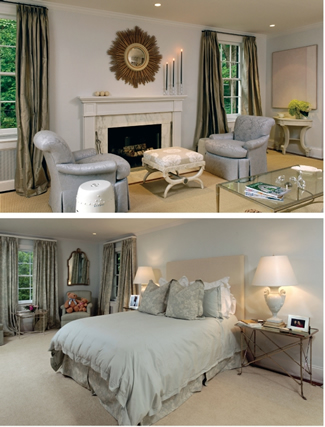
feel larger and more serene with the help of Rockville contractors Pedro and Antonio Tellez. "We gave a fresh, young, contemporary zing to it by finding space that wasn't being utilized," Randolph says. "You can make a house feel elegant without making it feel formal by cleaning up the space and furnishing it sparingly. Designers typically throw in too much stuff. " On the main floor, built-in bookcases and china cabinets were ripped out to streamline the rooms. To create a better spatial flow around the center staircase leading up to the second floor, doorways were raised and five-inch-wide oak- plank flooring was installed throughout. Walls were uniformly painted in a light bluish-gray and gray silk taffeta was hung at the windows. In the living room, a simpler, lower mantelpiece surrounded by white marble was substituted for a larger one to make the fireplace more in scale with the room. A vintage starburst mirror found by Randolph in Boston hangs above the mantel, and comfortable armchairs, covered in periwinkle-blue damask, flank the fireplace. A tufted sofa by Washington designer Thomas Pheasant was upholstered in a soft but durable indoor-outdoor lavender fabric and paired with a glass-topped coffee table from the couple's previous house. Artwork, both antique and contemporary, reinforces the light, tonal color scheme. Two pastoral plaster reliefs over the sofa subtly contrast with abstract canvases placed to either side of the doorway leading to the adjacent sitting room. Across the hall, the smaller dining room is simply furnished with ivory-painted Klismos chairs, designed by Randolph, pulled up to a custom-made round mahogany table centered in the space. At one end, reproduction antique mirrors and small console tables flank a large glass bay which incorporates French doors leading to the garden terrace. The room also reflects Randolph's rule for dining rooms: no rugs. "The minute you put a carpet," he says, "there's a maintenance problem, and the room
|

 designer began working to make the small house